Corporate Marks and Communication Mark
The Logo of Mitsubishi Materials radiate precision, confidence and reliability – it is known worldwide and has a high level of recognition.
The combination of the imperial three diamond-shaped trade mark and the classy, rounded Mitsubishi Materials lettering provide a perfect interaction. As well as the combination of the company coloures, MMC Red and MMC Black.
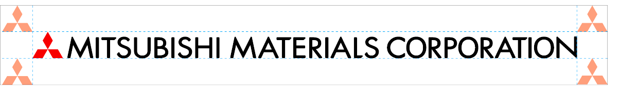
The Corporate Mark
Product catalogues / Price lists / Product Leaflets / Advertising and presentation materials / Online presence / Presentations from Japan / Exhibitions
![]()
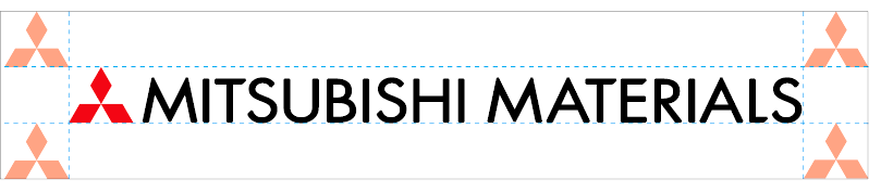
The Communication Mark
Product catalogues / Price lists / Product Leaflets
![]()
The Protected Zone
The logo has a protection zone in which no other element may be placed.
The protection zone results from the distance of a diamond, which ensures sufficient space around the logo.
Always respect the logo’s safety zone by leaving sufficient clear space around it. The logo should not be placed directly on colored or patterned backgrounds. Instead, use a monochrome safety zone (box) to ensure visibility and consistency.
![]()
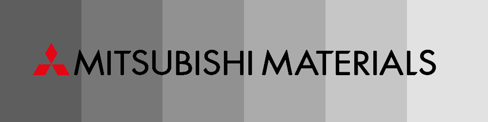
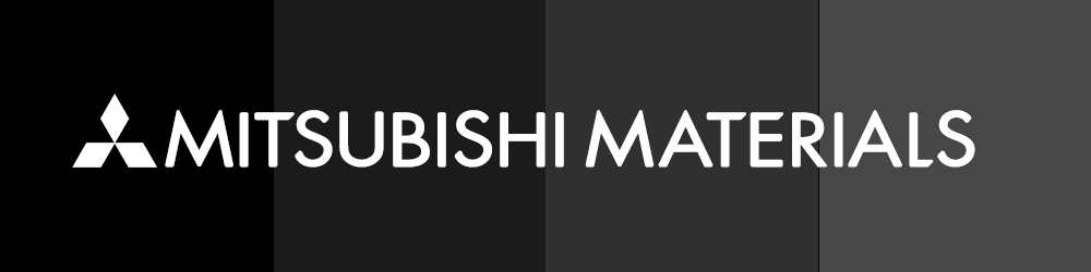
Background Contrast Rules
When placing the logo on backgrounds, always ensure sufficient contrast. This ensures maximum visibility and brand consistency.
On backgrounds up to 69% black, use the primary colored logo or the monochrome black version.
From 70% black or darker, only the inverted white (monochrome) version may be used.
The Minimum Dimensions
The minimum dimensions specify the minimum size in which the logo may be placed. No size smaller than this should be used, in order to ensure an optimal presentation of all logo elements. The minimum dimensions for presentation in print media is the logo width of 30 mm. In digital media, the logo width should be no less than 150 pixels.
 (min.: 150 px)