Details make the difference
Illustrations are utilized to complement and enhance visual communication, providing clarity and emphasis to the accompanying images. These graphics should adhere to the following guidelines:
- Purpose & Style: Illustrations should serve a clear purpose, such as highlighting specific features, providing explanatory context, or enhancing the thematic focus of the image. They should maintain a clean, professional style that aligns with the overall corporate identity.
- Consistency: Use line art, icons, or simplified graphics that integrate smoothly with photographic elements. Ensure consistent line thickness, color schemes, and aesthetic approach.
- Color Usage: While monochrome illustrations with red accents are preferred for general consistency, selective use of corporate colors is permitted for emphasis or thematic relevance. This is particularly applicable to topics like sustainability or innovation, where color can be used to reinforce the message.
- Placement & Integration: Illustrations should not overwhelm or detract from the primary image. Instead, they should act as subtle, guiding elements that support comprehension and engagement.
Illustrations are especially effective when providing explanatory context or drawing attention to specific aspects within complex visuals.
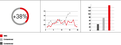
Charts
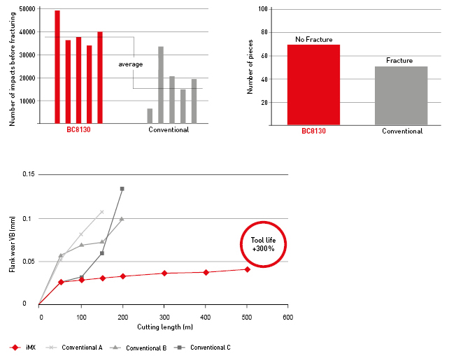
Supportive Graphics
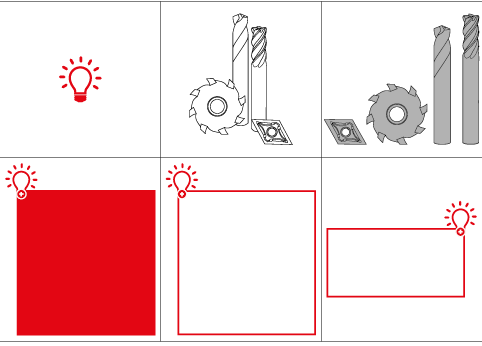

Graphical Illustrations

Illustrations Supporting Imagery